Over the last few years, search trends as reported by major search engines have shown a fast-moving upward trend in mobile searches. The smart phone has revolutionized the way we get information online, and our handheld devices are offering us a faster and more convenient way to find what we need while we are on the go. We use them to communicate, play games, pass time, check social networks, take pictures, and search. 45% of smart phone owners between 18 and 29 years old use mobile search daily.
Unfortunately, businesses aren’t responding to this trend as quickly. We’re still seeing a large gap in the amount of mobile searches versus the number of mobile websites and landing pages from the search results. Internet marketing agencies in website design Detroit are reporting that companies aren’t allotting enough of their marketing budgets to mobile websites and targeted mobile ads. A highly publicized recent study shows that 57% of consumers will not take action to contact or purchase from a company that has a poor mobile website – neglecting this aspect of your online presence can prove very costly in lost revenue.
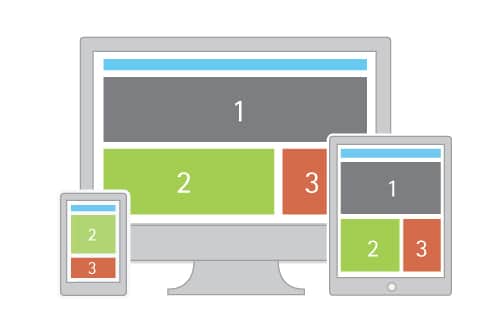
Based on the last few years, mobile searches – which have always trailed behind the number of desktop searches – are expected to surpass desktop searches for the first time ever in 2015. This means that smart phones will account for the majority of devices used to search for things online. Detroit Internet Marketing, LLC designs responsive websites that can detect the search device and display the corresponding website. So when your business appears on search results on a desktop, your regular website will appear when the link is clicked. However, if a mobile device or tablet is used to do the search and the searcher is directed to your website, the mobile site will appear in order to make it more user-friendly.
Trying to navigate a full size website on a smart phone or tablet is slow and generally frustrating. Misaligned links, unresponsive text fields, and content that can’t be read without scrolling back and forth as well as up and down…. Well, it’s no wonder mobile searchers leave full websites quickly without taking action.
Mobile websites condense the content and size the window to fit the screen. Larger clickable buttons, fewer images, and simpler formats make them easy to navigate through. Contact information is front and center, encouraging smart phone users to click the phone number and automatically call the business to speak to a human being. It is designed for quick conversion and simplicity.
Internet marketing for your Michigan business needs to go far beyond the basic SEO and social media principles. The landscape changes quickly, and your marketing campaign needs to re-adjust often. Contact us for more details about how our internet marketing company in Michigan can help grow your online presence.