Brightness Matters As Well
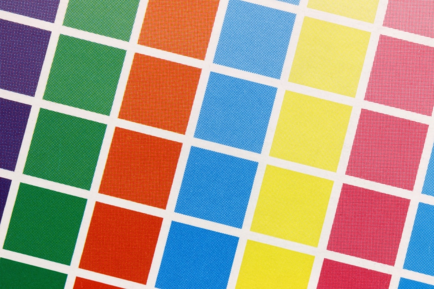
Brightness and hue are two different matters entirely. You can have a dark pink background without making it neon pink. Again, you need to consider the feelings that your audience will experience when they visit your website. Bright colors can be visually off-putting because they may seem like your website is screaming at the visitor. If you are going to use bright colors, try to do so in moderation. A subtle accent of vibrant orange may fit perfectly with a light yellow or green background, but it wouldn’t do well as the entire backing of the site.
Keep in mind that drawing attention to your website does not mean using bright colors. In fact, you can make a big impact simply by incorporating a good layout and targeted images into your design. Talk to your website designer about your goals and your audience so he can make adjustments in your website.
Color Combinations
Assuming you use more than one color, you need to make sure they don’t imply something together (unless you want them to). For instance, using red and blue in your web design may imply a sense of patriotism, even if the site has nothing to do with that. Yellow and green may imply something about plants and the summer. Consider the instinctive references people have for sets of colors before slapping two of them together. You may be better of using multiple shades of the same color to create a cool, monochrome design for your website.
You will also need to assess the contrast two colors have with one another. If this contrast is too sharp, it may hurt people to look at your website. If you use black alongside a light color like yellow or orange, you may have too much of a contrast for people to naturally appreciate. Switch the black with a dark grey, and you can still maintain the same overall idea without as much contrast to get through.
Inspiration
If you’re still stuck on which color you should use, check out ColorCombos.com. This site showcases random combinations of color that you might find appealing. Think of the first reaction you get from the combo and see if that is what you want your customers to experience. If not, pick something else. It may take a little trial and error to come up with the perfect colors, but you’re sure to be a success in the end.